Magazine Ad
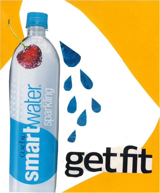
In this ad you are looking at Sparkling Smart Water. In my ad I used a lot of line, color and balance. In my ad I used different shades of blue and a shade of yellow to help balance out the ad. I think that the yellow helps the blue stand out which makes the water bottle, which I am advertising stand out. I used yellow as a frame, using line for the outer side surrounding of the water bottle and overlapped words at the bottom of the ad "get fit,' to help add balance to the add itself. During this project I learned that not every blank white spot needs something in its place and sometimes things look better not too clustered when some spots are empty and others are filled with different shapes and colors.
Flyer #1
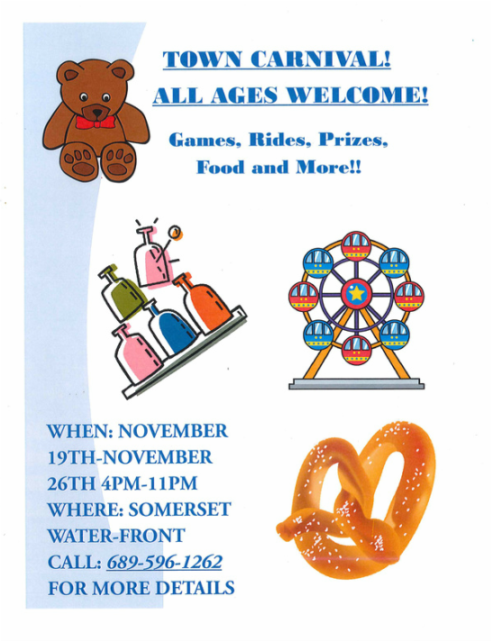
In this flyer my goal was to advertise for a town carnival. I included, where, what, and when it will be. I also included pictures of some things that will appear at the carnival. In my flyer I focused on color, shape and line. For my flyer most of the colors I used colors that would pop, mostly blues,purples and reds. I used different shades of blue to present my flyer, and used pictures to overlap. In my flyer I used different shapes in my pictures, most of them are peculiar shapes but different shapes I used to overlap to make the colors pop. I used line in my flyer, mostly lines that curved or lines in my pictures I used in my pictures. Lastly my principle for this design was balanced I showed balance in my flyer by overlapping pictures over shapes and using different shades of colors.
Flyer #2
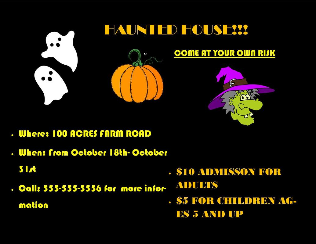
In this flyer, flyer number two I advertised for a haunted house. I used different fonts and colors that went with the theme in my flyer to get the message across that the flyer was specifically for a haunted house. In this flyer I used color and form. I mostly used blacks oranges and yellows, because mostly during this time of the year colors like these are used. Since my flyer was based on a haunted house which usually only occurs around the time of Halloween I tried to stick with colors like the ones I used above. I also used form in my flyer. Form is shown throughout the whole flyer, mostly recognized in the pictures of the flyer, the visible shape or configuration of something is known as form and in the pictures a visible shape is shown through each.
Flyer #3
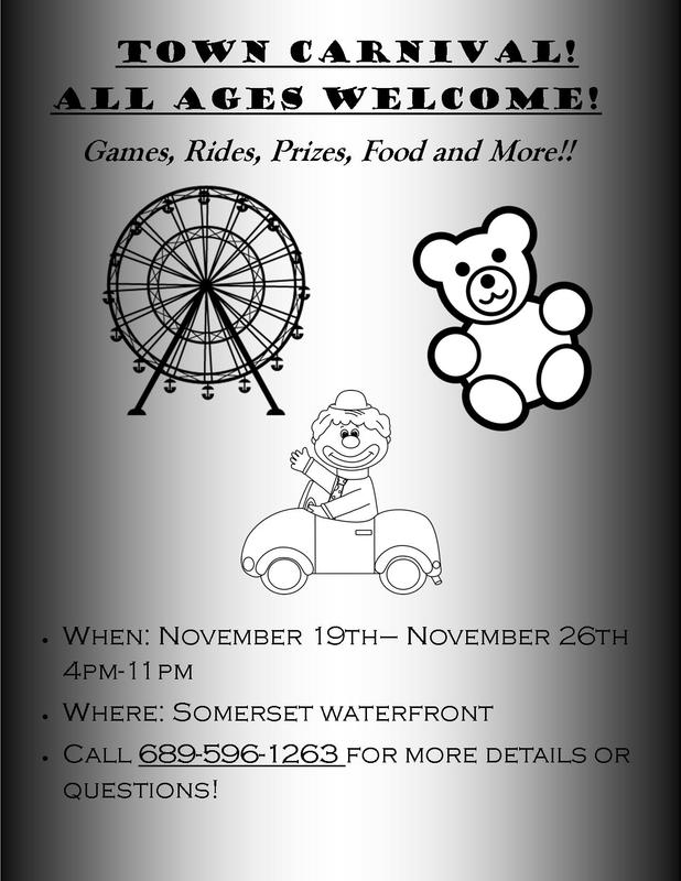
In this flyer, flyer number three I advertised for a town carnival but made it in black and white as I was assigned to do so. I did this by using black font and black and white images with a black and white background. I used pictures carnival related and used all the same information for this flyer. I used balance and color in flyer number three, I balanced out all the shades of blacks and whites and made some pictures smaller or larger than others. For color I kept a color scheme of blacks and whites to keep my color scheme consistent. From these flyers I have learned to keep a consistent color scheme and a balance between images that I choose.
Brochure
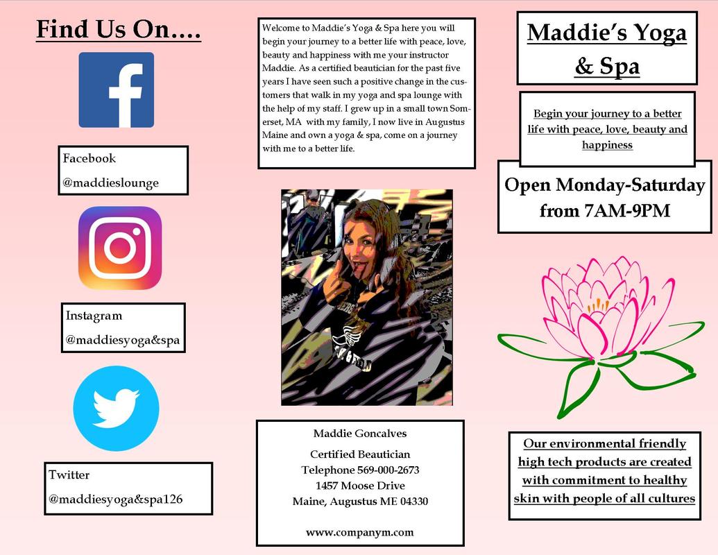
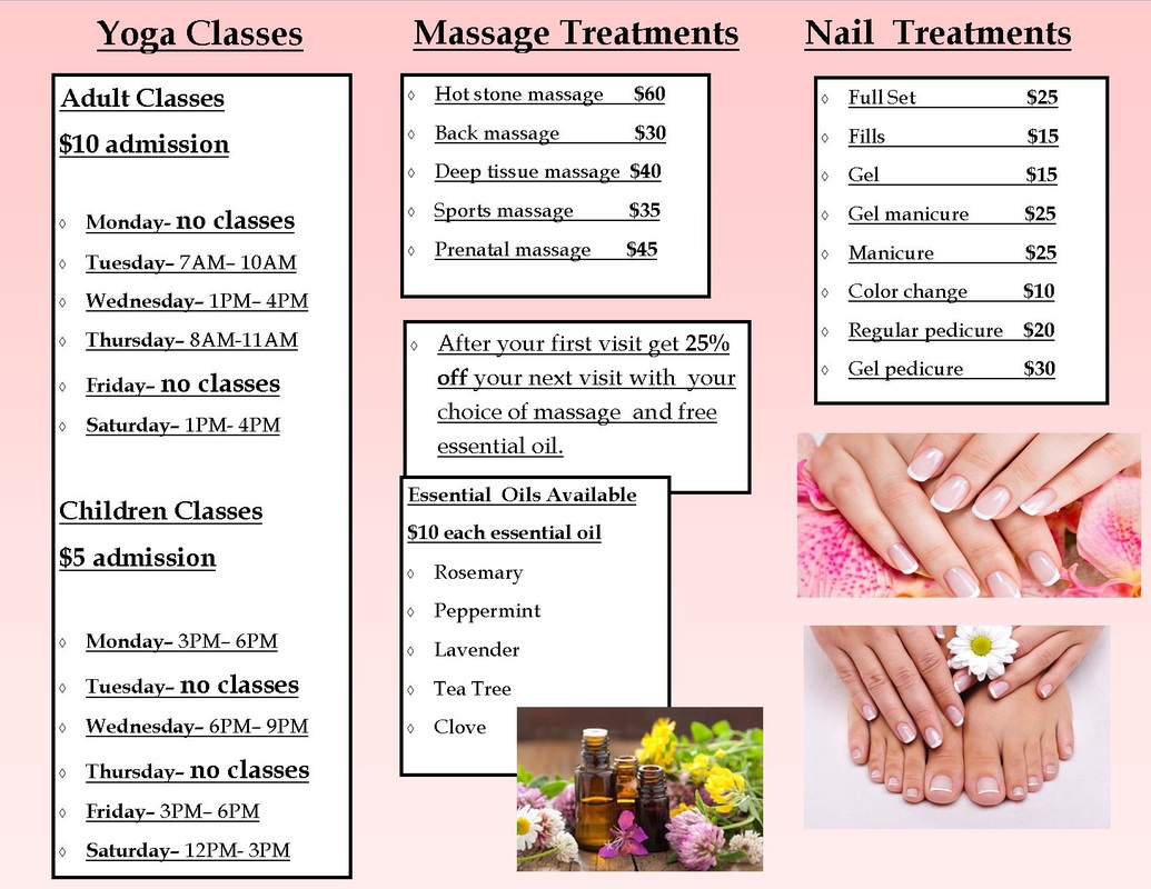
In my brochure I advertised "Maddie's Yoga & Spa" a yoga and spa lounge for all ages and a chance to get rid of stress and clear your mind with happy and peaceful thoughts. Here at the spa you can find yourself participating in a yoga class or maybe even getting one of our famous massages with your choice of essential oil. In my brochure I created a look that used a certain color scheme of pink, black and white. I also included line in my brochure using the boxes that I outlined important information to make the text stand out. In my brochure I also included principles of balance and proportion. To include balance in my brochure I overlapped pictures to create space and make certain images/text stand out. Proportion was created throughout my brochure by making some pictures bigger than the others, creating a relation between the many pictures throughout my brochure.
|
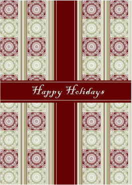
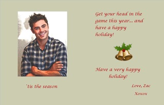
Greeting Card
|
|
|
I have created a greeting card in Microsoft Publisher from Zac Efron wishing me a Happy Holiday. I also worked with Adobe Photoshop to create a certain look to my picture I chose. I raised the brightness and contrast on my picture to add a brighter look to the photo I chose. I also included a filter on my photo to add a scratchy look to my photo to create a unique look. Lastly I changed the exposure and offset of my photo to add a shadow like figure in the back of him in the picture. In the card I added a unique happy holiday greeting from Zac and his signature to put an end to the greeting card. This assignment taught me how to make a card on Microsoft and to edit a picture in photo-shop with the different scales and values and to create a fuzzy look to the picture.
Thayer Street Brochure
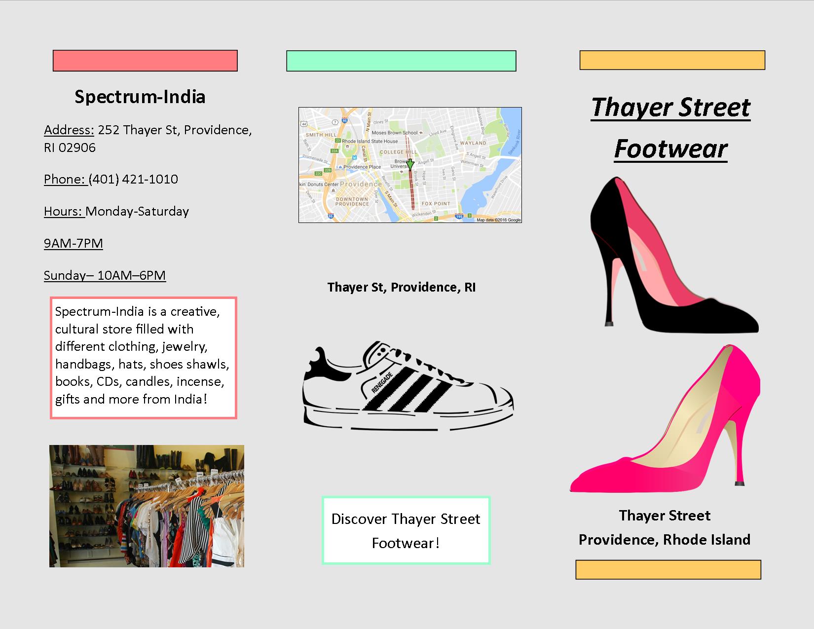
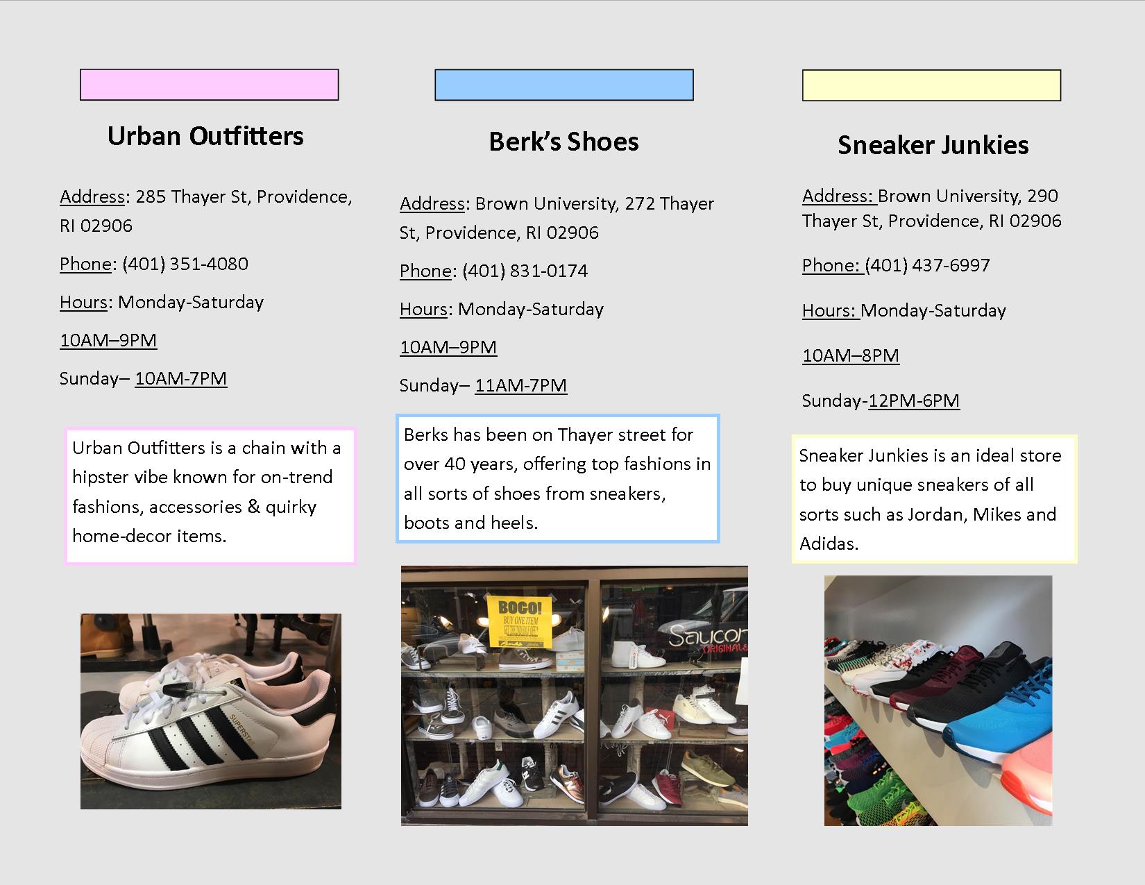
This brochure was created with Microsoft publisher with the help of tools like the shape tool and pictures I took from our Thayer street filed trip. The main purpose of this brochure was to create a travelers guide if they were to ever visit Thayer street shoe stores. Information included in the brochure like the time the store opens and closes, where on thayer street the store is located and a small description of the store. I also included a map on the back of the brochure to help people locate thayer street in providence to enjoy the many shops and restaurants. This project taught me about all of Thayer's streets history and background of many of the stores.
